
The Perfect Name Badge (Blueprint Included)

In my opinion, this is a great definition of a name badge:
Name badges are communication tools that facilitate connection between strangers. They reduce friction by exposing identification information about the people wearing them. — Philippe Lehoux
As any tool, it needs to be designed. It has to be aesthetic but most importantly, functional. That’s why we invested some time in creating the blueprint of the perfect name badge (according to us at ConferenceBadge.com)
Basics
The single most important part of a name badge is the person’s first name. As Philippe points out, to facilitate a connection between strangers, it’s crucial to know the person’s name.
The rest can be known with a 2 minute chat. Actually, leaving some info out can be a good thing, as it can spark a conversation with questions like “what do you do at Company’s Name?”.
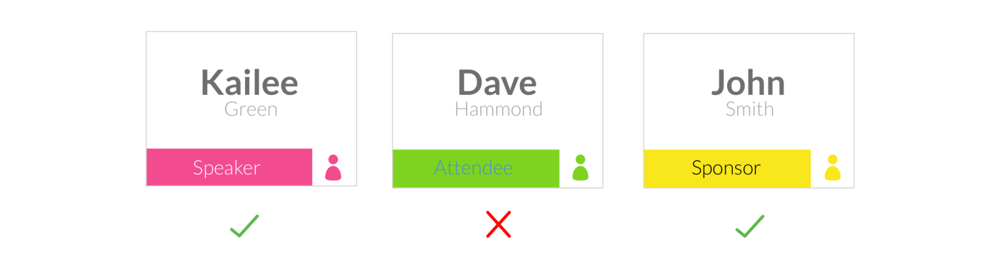
This is our take on badge information hierarchy:
First name
Company Name
QR code
Badge type
Last name
Conference logo
Aesthetics
We’ve chosen Lato as our go-to font. Fun fact, Łukasz Dziedzic Warsaw-based designer, created this font in the summer of 2010.

The semi-rounded details of the letters give Lato a feeling of warmth, while the strong structure provides stability and seriousness. “Male and female, serious but friendly. With the feeling of the Summer,” says Łukasz.(1)
For first-name-font-size, 60 px, and we also propose a strong colour, something that heavily contrasts with the background of the badge.
For last name, a lighter font and lighter colour works great.

Colour-coding the badges with a simple banner on the bottom is always useful, just remember to also apply contrasting colours to the text.
This can help out staff easily to recognize specific badge type in a sea of people.
Finally, the back the badge. We recommend printing the same thing on both sides, in case the badge flips. But it can also be a good idea to include your event’s schedule, the wifi code or your sponsors’ logos.

Although we recommend a 3" x 4" badge size, these guidelines can be applied to any other format of your liking.
QR codes
Although compulsory in no way, QR codes can be quite useful for letting your attendees do lead retrieval in an efficient way, especially since now iPhone users will be able to scan codes with their native Camera app.
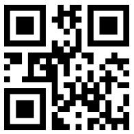
These intricate squared pieces of information also work to check-in people at the event’s entrance or to hide information from the naked eye, like food preferences or ticket types.
Last words of advise
A recurring issue is the size of the conference’s logo. Organizers tend to make them too big. We believe this is not necessary since most people don’t usually attend multiple conferences in a single day and have a clear idea of the event they’re going. If you need a big logo you can easily put on the back of the badge.
In case your adding the schedule, try not putting every detail in, otherwise you’ll need to use a small font to cram everything inside and it will be difficult to read. Try creating a summarized agenda and include only important information.
Prioritize the information you want to display by playing with font weighs and more importantly font sizes.
Last but not least, name badges are an extension of your event’s image, they should look as good as they possibly can and serve their purpose. Using tools to simplify the process is a great way to minimize work and frustration.